

Activity fields and layouts
Field limits and platform-specific appearance for progress activities and interactive iOS cards. The lifecycle guide is Track work.
State fields and iOS layouts
| Field | Type | Description |
|---|---|---|
| title | string, required | Task name, maximum 80 characters. Required at start; may be replaced by an update. |
| status | string, required | Current stage, maximum 60 characters. Required at start. |
| subtitle | string | Optional short second-line summary replacing visible status in expanded/Lock Screen layouts only, maximum 120 characters. Compact and small-banner views retain status. null clears it. Display budgets below are smaller than the accepted payload limit. |
| detail | string | Optional supporting text, maximum 240 characters, shown in a two-line detail region. null clears it. Overflow remains bounded to the available layout. |
| progress | number | Optional fraction from 0 through 1. null clears it. |
| symbol | enum | Progress icon: terminal (default), code, build, success, or warning. |
| accentColor | string | Six-digit hex, #RRGGBB. Defaults to #246BEB. |
| style | enum | iOS progress layout: standard (default), ring, hero, terminal, or steps. Updates can select another layout; older builds may use the default. |
| privacyMode | enum | standard or private. On iOS/APNs, private replaces start-alert text with a generic message; the activity content still includes its title/status. |
| key | string, start only | Start-time alias, maximum 100 characters, accepted in place of the generated activity ID. Reusable after the previous activity becomes terminal. |
| replace | boolean, start only | Start-time replacement flag (default false). Ends only the matching active key owned by the same requester. The response includes replaced. |
| deviceIds | string[] | Start targeting list of 1–50 device IDs. Omit for eligible capable devices. |
These are iOS layout choices, illustrated below. Progress layouts and interactive choice layouts serve different requests. Native Android shows ordinary notifications; it does not reproduce ActivityKit, Dynamic Island, or this layout gallery. These captures illustrate layout rather than proving push delivery.
Use a short title for the task name, status for its current stage, and subtitle for a whole-word second-line summary when useful. Display budgets guide writing; they are not guaranteed fit or API rejection limits. Glyph widths, device size, locale, and text size change available space. The native layout measures text, can reduce it to 75% of its base size, then clips at a whole-word boundary if needed. Original text remains available to VoiceOver.
Expanded Dynamic Island and Lock Screen layouts keep a static second-line summary. Its overflow continues before explicit detail in a two-line detail region; title overflow does not crowd that region. Compact views hide title, subtitle, and detail; they retain status with a suggested eight-character authoring budget when progress is absent, except terminal, which shows its prompt icon. Actual fit uses measured width rather than a fixed character cutoff. With progress, the percentage takes precedence. Detail can still exceed its two-line space; do not rely on every accepted character being visible.
| Field | Type | Description |
|---|---|---|
| standard | Compact | title 0; subtitle 0; status 8; detail 0 |
| standard | Expanded / Lock Screen | title 32; subtitle 36; status 36; detail 100 |
| ring | Compact | title 0; subtitle 0; status 8; detail 0 |
| ring | Expanded / Lock Screen | title 32; subtitle 30; status 30; detail 80 |
| hero | Compact | title 0; subtitle 0; status 8; detail 0 |
| hero | Expanded / Lock Screen | title 24; subtitle 36; status 36; detail 100 |
| terminal | Compact | title 0; subtitle 0; status 0; detail 0 |
| terminal | Expanded / Lock Screen | title 36; subtitle 40; status 40; detail 100 |
| steps | Compact | title 0; subtitle 0; status 8; detail 0 |
| steps | Expanded / Lock Screen | title 32; subtitle 36; status 36; detail 100 |
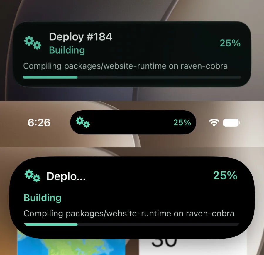
standard — Default progress card with an icon, two text lines, percentage, and horizontal track.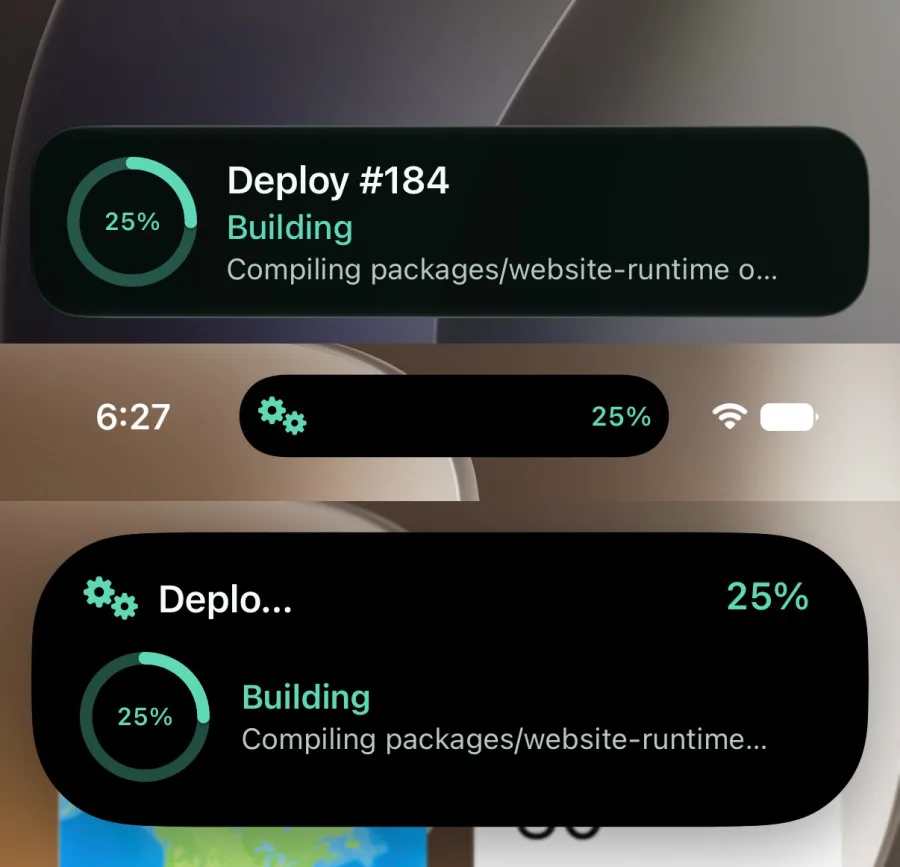
ring — Circular progress display with the percentage inside the gauge.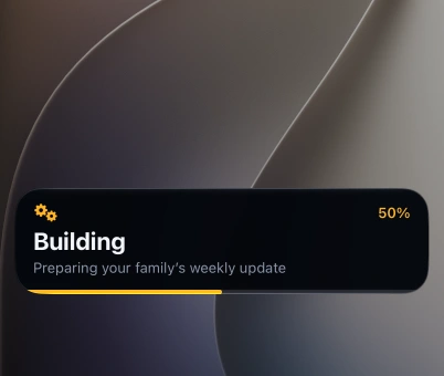
hero — Large status text above a bottom-edge progress track.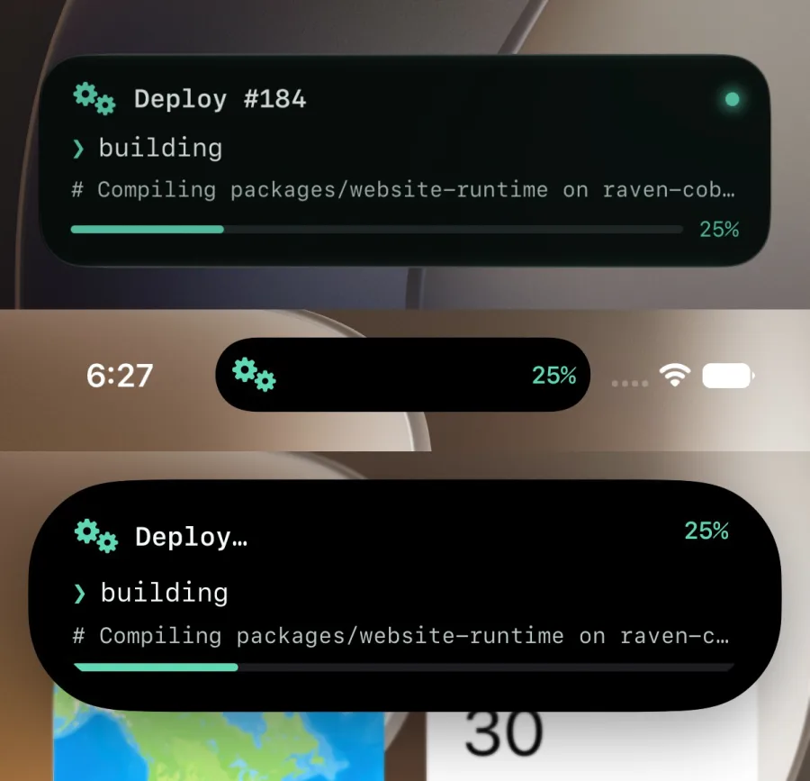
terminal — Command-prompt presentation with monospaced status and secondary detail.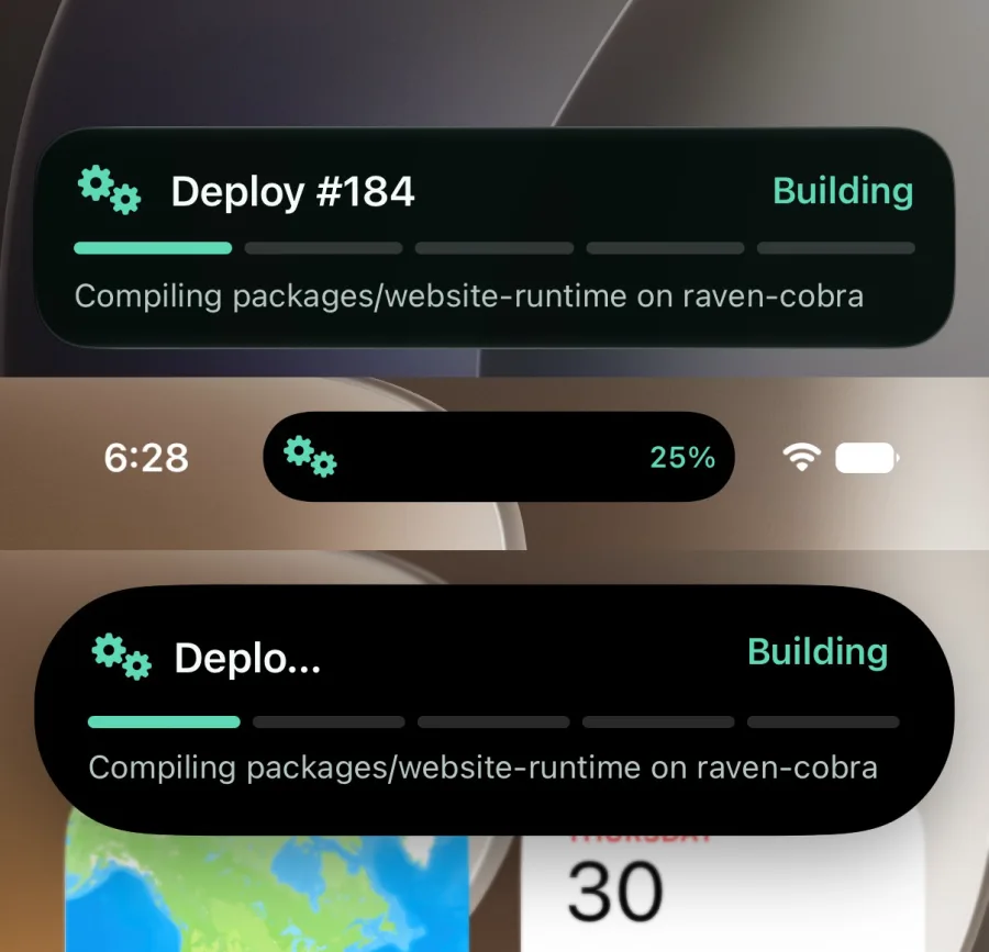
steps — Five stage indicators for workflows better described by phases.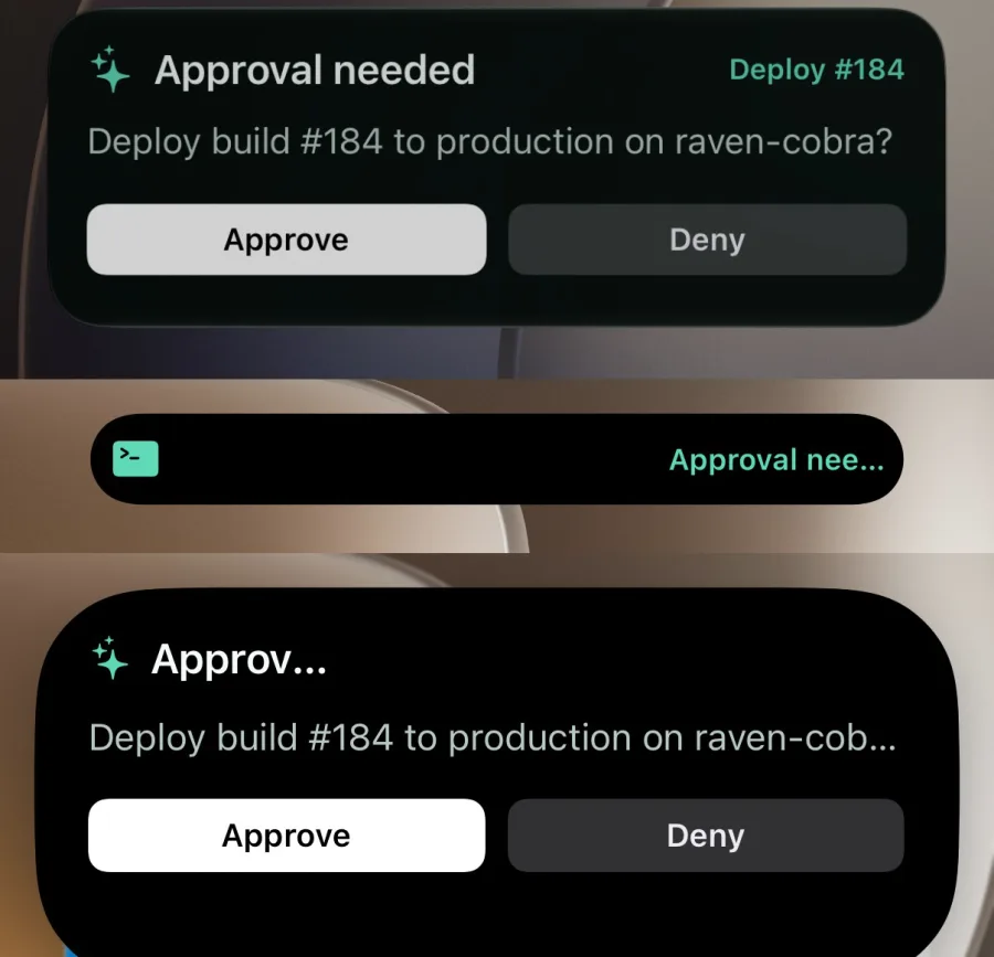
approval — Default two-choice prompt with balanced decision buttons.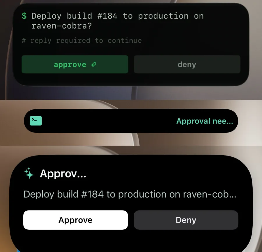
shell — Compact command-style question and decision controls.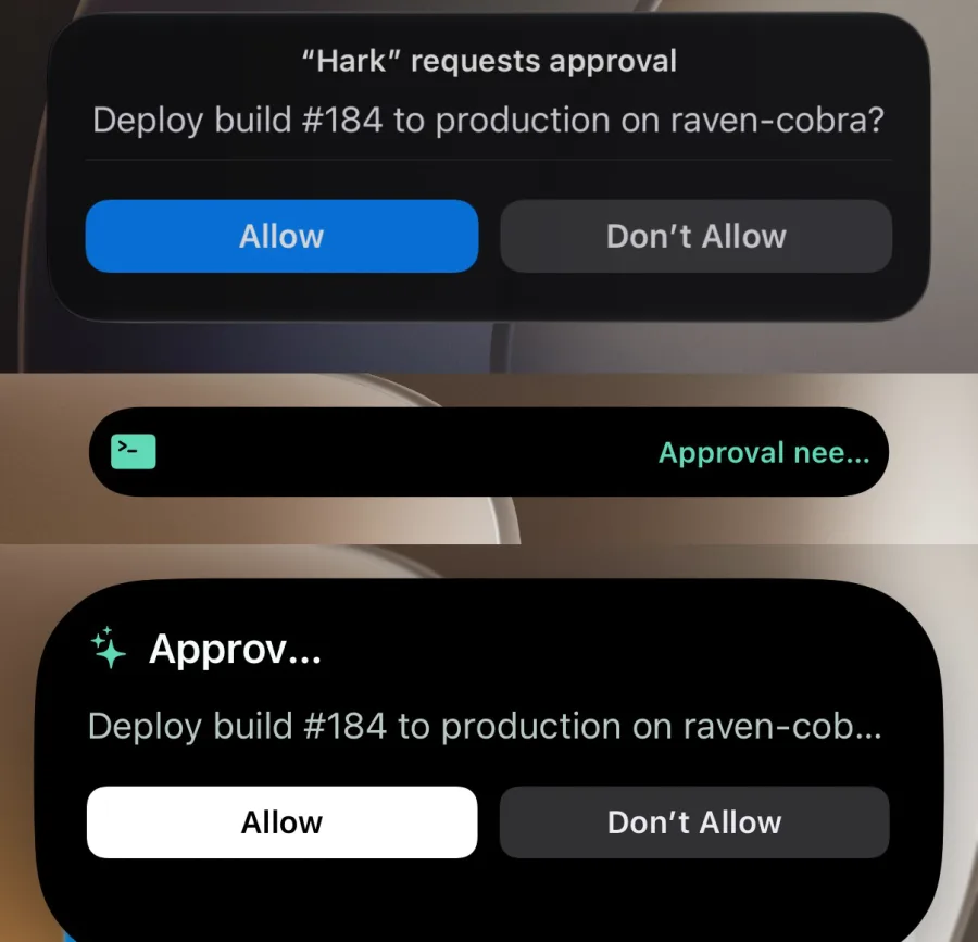
verdict — Centered question with a divider and prominent primary action.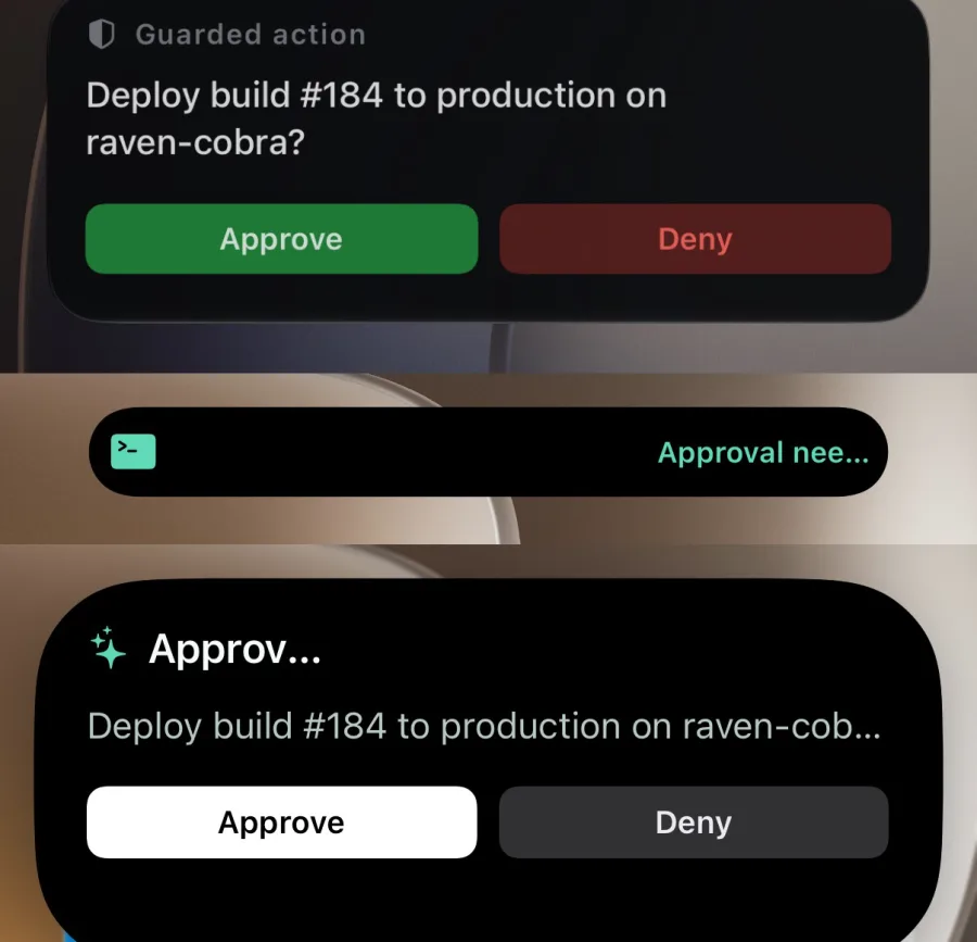
signal — Decision card with distinct positive and negative controls.Webhook reference
Exact notification routes, payload fields, HTTP outcomes, and receiver formats. Use the task guides for a first send or question; use this chapter when wiring a sender or callback receiver.
CLI reference
Create persistent service endpoints and integrate the terminal client into scripts. Connection setup lives in [Get connected](#cli-install); send, ask, and activity examples live with their task guides.